How State Economies Rank Compared To Other Nations

This amazing map shows just how really big the U.S. economy is!

How State Economies Rank Compared To Other Nations

From The Washington Post:

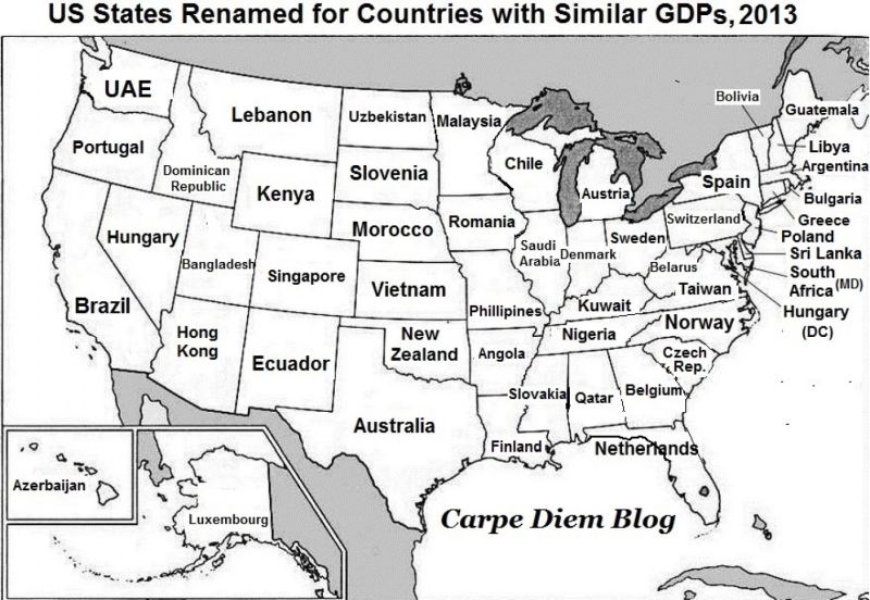
The American economy is really big. That’s the takeaway of this fascinating map of the United States from Mark Perry, an economist who runs the Carpe Diem blog at the American Enterprise Institute.

The map, which has been around for a while, has a lot of explanatory power when it comes to America’s position in the global economy. For each state, Perry finds a country that had a roughly similarly sized economy in 2013.

The results are pretty stunning: California, America’s most economically powerful state, has a gross domestic product roughly the size of Brazil’s. Texas pumps out around the same GDP as Australia. Ohio’s economy is as big as Sweden’s, while New York’s economy is similar to Spain’s.

The smaller states are interesting, too: Connecticut’s GDP is roughly similar to Greece, while Utah is on par with Bangladesh. Alaska’s GDP is about the same size as the tiny European country of Luxembourg.

Altogether, the map drives home just how massive the U.S. economy really is. U.S. GDP was about $17.4 trillion in 2014, followed by China with $10.4 trillion. (It’s worth noting that many of China’s provinces are the same size as country economies as well.)

Other countries trailed much further behind the United States and China in 2014: Japan ($4.6 trillion), Germany ($3.9 trillion), Britain ($2.9 trillion), France ($2.8 trillion), India ($2.0 trillion), then finally Brazil ($2.3 trillion).

These rankings are based on nominal GDP and don’t take into account differences in the cost of living around the world. GDP can also be measured on a purchasing power parity (PPP) basis, which takes into account the cost of living and inflation. Economists see this practice as a better way to capture standards of living around the world — the idea being that, if certain goods and services are very cheap in your country, you can have a high standard of living even if you don’t make a lot of money.

On this basis, China’s economy is a lot closer to the U.S. economy in size. According to IMF figures, China’s PPP-adjusted GDP was $17.6 trillion in 2014, ahead of the United States at $17.4 trillion.
 

via

Countries With The Most Venomous Animals

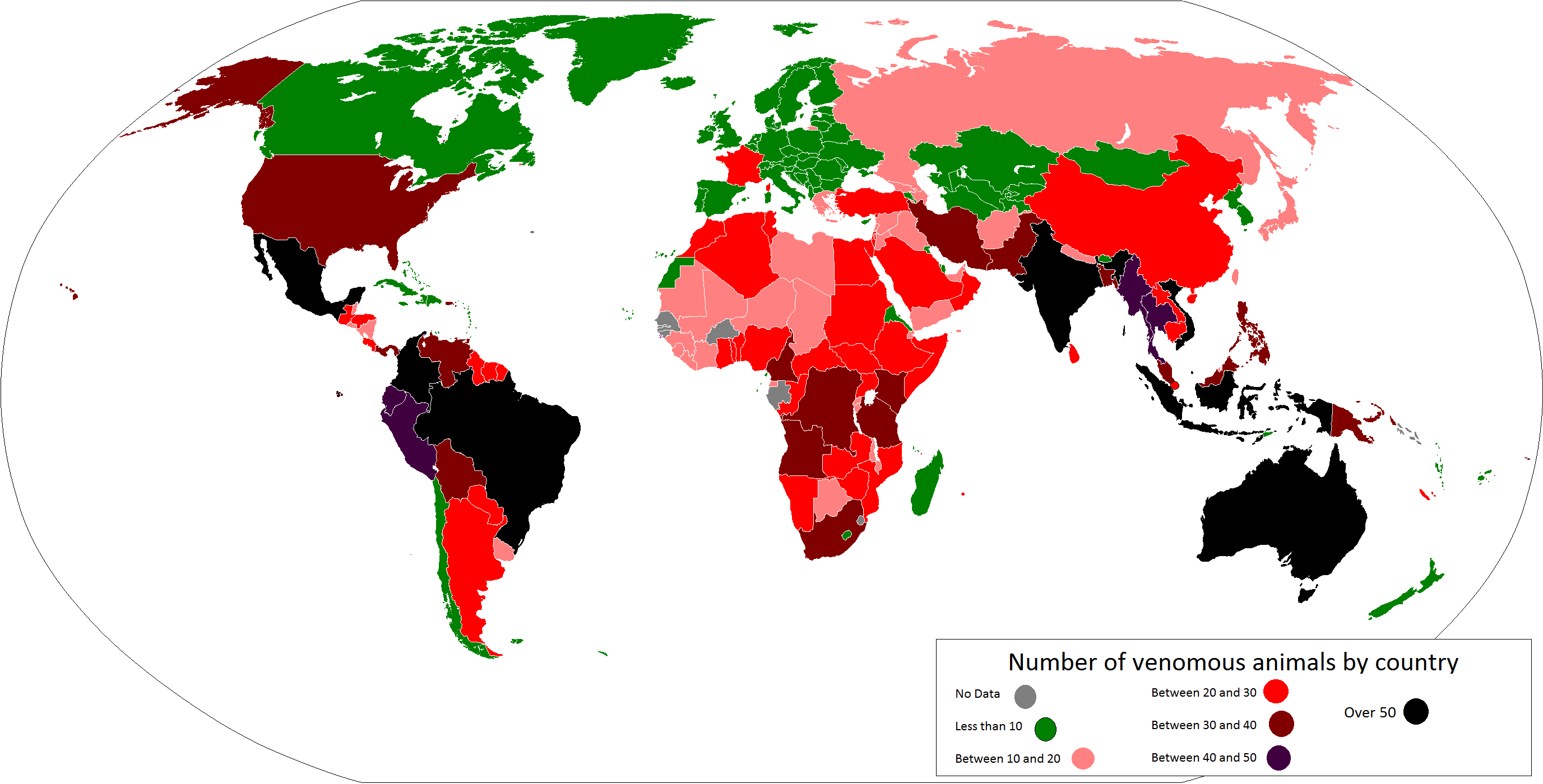
Which country has the most venomous animals?

Which country has the most venomous animals

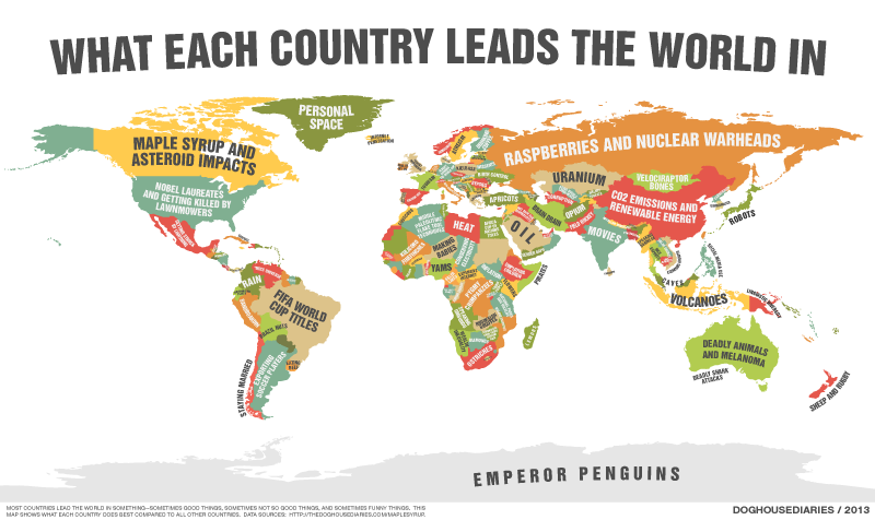
Surprisingly, it’s not Australia but Mexico with 80, followed by Brazil with 79 and then Australia with just 66 (they just happen to be more potent). So how is venomous defined here?

Reddit user lanson15 used the Living Hazards Database from the Armed Forces Pest Management Board, which “… is a comprehensive compilation of more than 500 species worldwide, which are reported to cause serious injury or death of humans.”

In addition to the top 3 countries above, Colombia, India, Indonesia and Vietnam all have over 50 different species apiece. Europe, Central Asia and Canada are at the other extreme, with fewer than 10 species per country. And if you’re wondering about France, it’s because it includes French Guiana, which is considered an overseas department of France.

Generally speaking warmer places have more venomous species than colder places, although there are some interesting exceptions to this rule such as the Caribbean, Western Sahara, Madagascar, Bhutan and Lesotho, to name a few.

So if you make your travel plans based around how likely you are to get bitten by a snake or spider, you now have a map of which countries to visit and which to avoid.

Source…


What Each State Has More Of Than Others

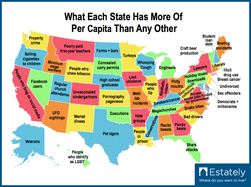
Real estate website Estately created a map of the United States that shows what each state has more of than the others.

What Each State Has More Of Than Others

Deciding which American state to live in isn’t easy. It’s like entering an all-you-can-eat casino buffet with the limitation of only being able to choose one food item. Before deciding where to live and buy a home it’s important to be informed, which is why Estately has compiled this map and list of what each state has more of per capita than any other. Some are good, some are bad, but all are unique to that specific state.

Source…


The Amount Of Snow It Takes To Cancel School

How much snow does it take to cancel schools?

The Amount of Snow It Takes to Cancel School

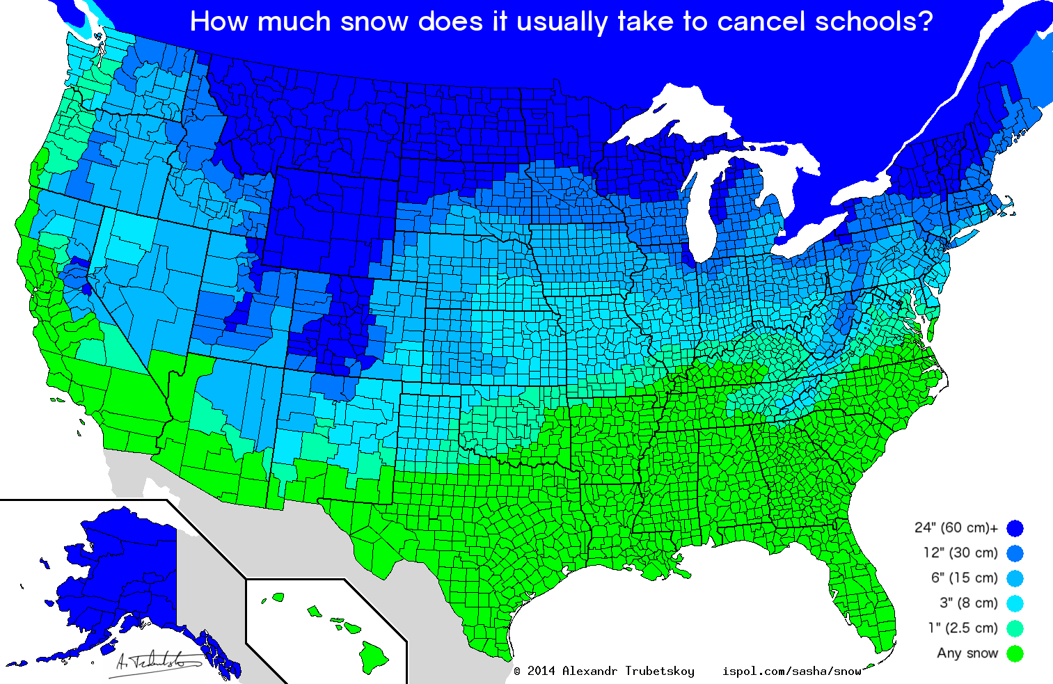
Data was taken from hundreds of various points from user responses on Reddit and interpolated using NOAA’s average annual snowfall days map. Any corrections/additions are welcome, just give a decently specific location.

The lightest green says “any snow” but also includes merely the prediction of snow. Also, this is snow accumulation over 24 hours/overnight.

In much of the Midwest and Great Plains, school closing often depends more on wind chill and temperature than on snow accumulation (“cold days”). Thus, this map may be misleading in those areas.

Many jurisdictions in California and other western states have significantly varied snowfall, depending on elevation. This makes it difficult to find an “average” number, or often makes it misleading.

Urban areas like Chicago and New York have more resources to clear snow and often need more to cause closings.

To everyone saying “I grew up in so-and-so and we never closed school,” policies have changed in the last 20 years to make closing a much more common occurrence. Just because schools stayed open back then doesn’t mean they do these days.

Hawaii does get snow! Just… not where people live

Source…

via

Load More